Have you ever captured data that looks a little too dark or too bright? Sometimes we mess up the camera settings or the lighting conditions change considerably during capture. Or maybe the features you’re most interested in are underwater or in the shadows, so they’re naturally a little dark. What if you know there are variations between features or elevation values in your data, but you just can’t see the difference in your image? Contrast enhancement may be your answer!
Let’s have a look at what’s happening when we enhance the contrast of our images, and how it can help us ‘see the unseen’!
Contents
What is contrast enhancement?
Enhancing contrast allows us to more easily visually interpret our images by increasing the display contrast between individual pixels in an image. But what does that actually mean?
While there are an infinite number of colors and their shades, a computer is only able to display a range of 256 shades across red, green, and blue. So every pixel in an image must be given a display value of between 0 and 255. The darkest pixels in an image will have values closest to 0, while the brightest will be closer to 255.
But that doesn’t meant that our data have values between 0 and 255.
When we perform contrast enhancement, we are selecting a range of the actual pixel values, and forcing the computer to display that range between the values of 0 and 255.
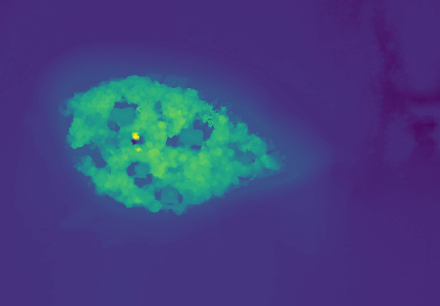
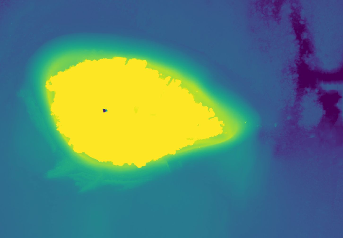
The image comparison below features a digital surface model from Low Isles (courtesy Brooke Conroy and Prof Sarah Hamylton, University of Wollongong). Without enhancement, the computer displays the minimum value in the image of -4.5m as 0 (dark), and the maximum image value of 22.37 as 255 (bright). With enhancement, we are focusing our attention only on pixel values between -2.6m and 2.8m.
This means that the full display range of 0-255 is applied to this narrow data range. In doing so, we have sacrificed our ability to differentiate between tall features on the island as everything is equally bright. But we can now distinguish fine variations on the beach and underwater instead.
Enhancing contrast with multi-band data
The above example of a digital surface model is relatively simple given there is only one value (elevation) in every pixel. But how does this transfer to images that have more than one value?
The most common drone data that people capture for mapping consists of three bands or layers – red, green, and blue (RGB). This means that we have the challenge – or opportunity – to enhance contrast for all three bands.
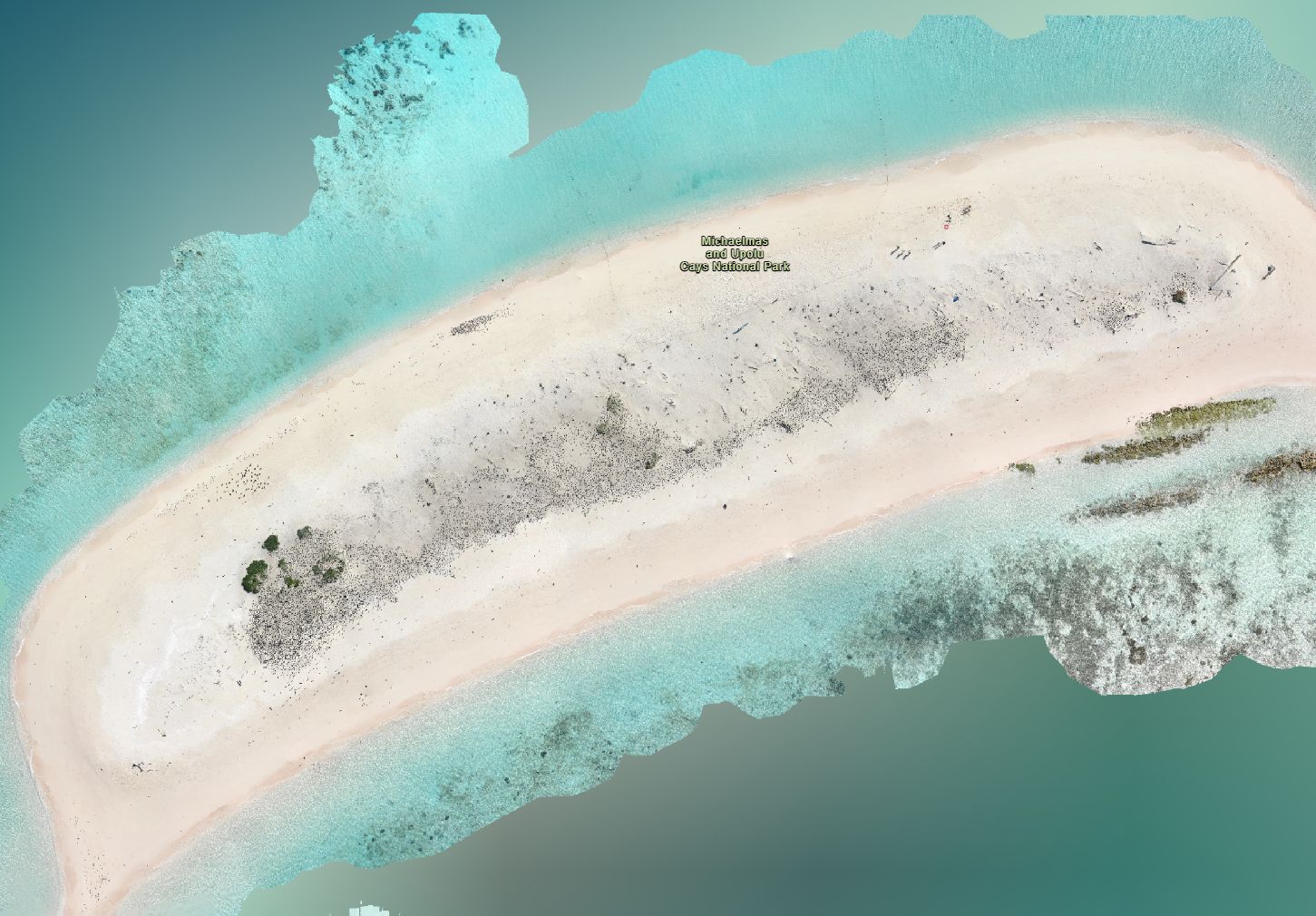
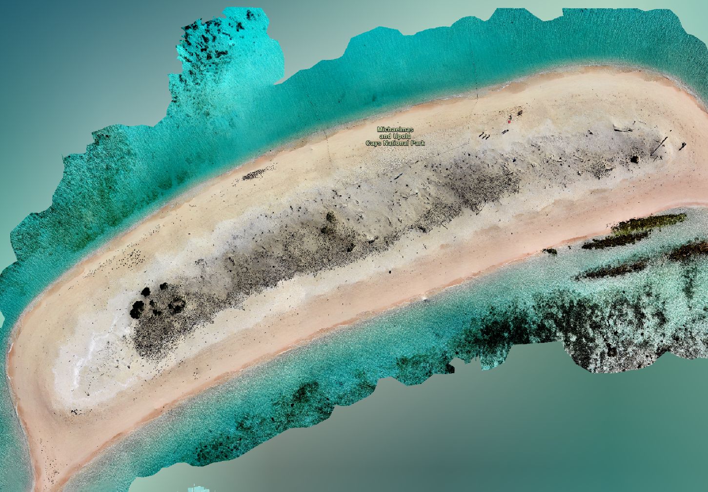
In the example below, the original data from Johanna Karam (Queensland Department of Environment, Science, and Innovation) was captured on a super sunny day and is over exposed. After contrast enhancement, the colours look more natural rather than washed out. It also helps us detect features with more confidence.
Do enhancements alter data?
Enhancing contrast as per the example above do not change the values in your pixels at all. It’s purely for visual interpretation purposes. So you never have to worry about ruining your data if you get your enhancement wrong! It’s all reversible. And in fact, playing around with contrast, especially with your own data is the best way to learn more.
Let’s do it!
Most – if not all – image processing and GIS software packages will have options to perform contrast enhancement on your image data.
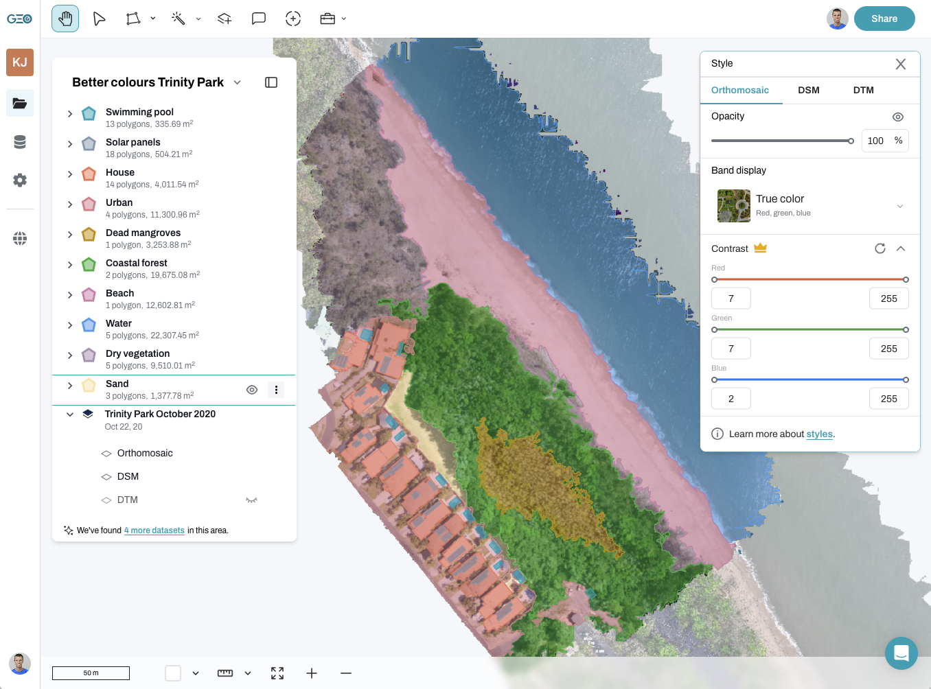
The animation here shows how easy it is on GeoNadir:
- Select the dataset
- Open the toolbox
- Choose ‘enhancements’
- Choose ‘enhance contrast’
- Change the minimum and maximum range as needed!
Your display will automatically update to give you instant feedback on the contrast range you have selected.
This is as much of an art as a science, so go ahead and have a play! You’ll get the hang of it the more you practice.

If you’ve enjoyed this blog, you might also like:
- How to make an accurate and useful drone map
- Multispectral drone mapping unpacked
- Ground control points can increase your drone mapping accuracy

