
In the previous posts in this series, I’ve argued that rehabilitation success is better understood through behaviour over time than through what can be seen in a single snapshot, and that comparison to analogue sites provides essential context for interpreting change.
There is one dimension that quietly underpins all of this, yet is still routinely undervalued in monitoring design. Time. Not just how long rehabilitation has been underway, but how often and when we observe it.
There’s no argument our ability to track progress is key to ‘ticking the box’ on rehabilitation success. On the way to meeting this, I’ve had so many conversations with people about the optimal spatial dimensions (ground sample distance and spatial extent) for a particular metric. And people will debate the value of different drone altitudes for image capture. But I rarely see the same consideration given to time.
So are we optimising the temporal dimension for data capture, and what happens if the the time stamps we choose aren’t the right ones?

The same site, many possible stories
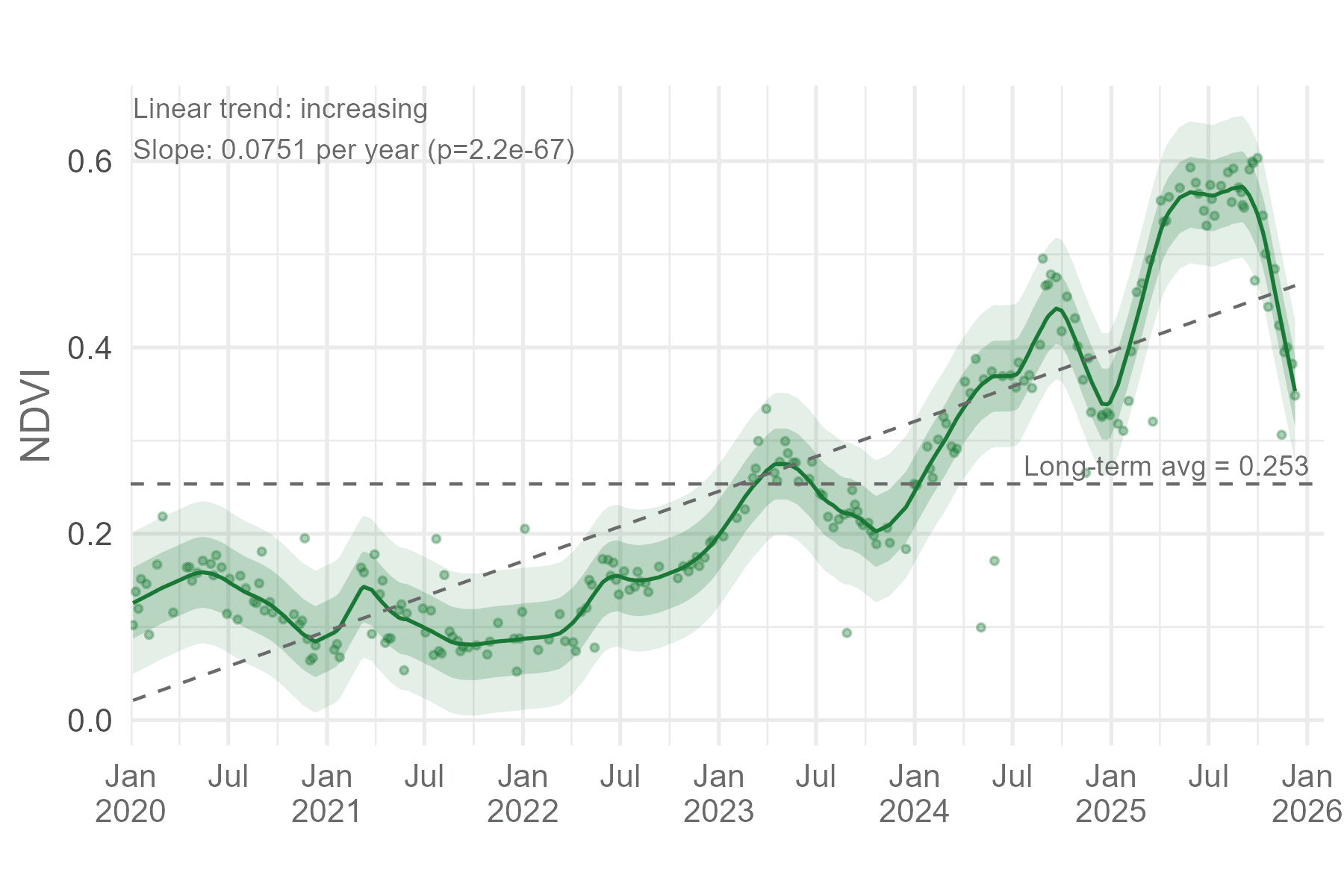
To explore this, I looked at vegetation change at an Australian mine rehabilitation site using NDVI as a simple, familiar proxy for vegetation condition. NDVI isn’t the point here though. The same logic would apply to any index, metric, or measurement. The actual location is also not important for this analysis, so don’t worry about that.
Using all valid satellite observations over the site from 2020 to 2025 (>250), a clear picture emerges. The site shows:
a strong seasonal cycle
increasing peak and baseline values over time
recovery after periods of decline
an overall upward trajectory
Taken together, these signals are consistent with a system that is progressing, but still dynamic.
This is the most complete story we can tell from the data.
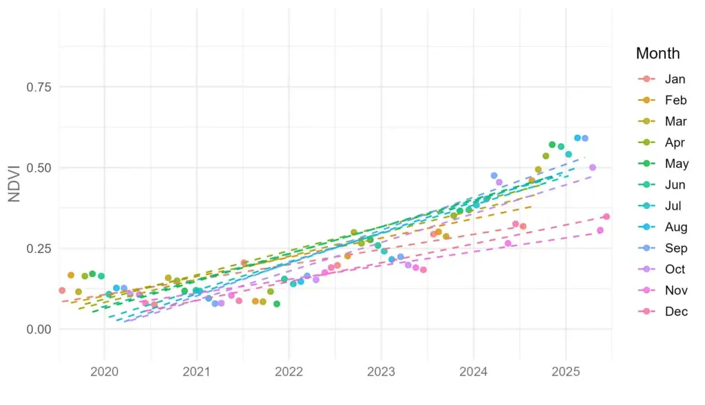
What happens when we sample less often?
Now imagine a more typical monitoring scenario: one observation per year.
Using the same underlying dataset, I extracted a single value per year, repeating this exercise for each calendar month. In other words, I asked:
What trend would we infer if we always sampled in January? In February? In August?
Each of these sample months produces a different linear trend. Some suggest rapid improvement. Others imply much slower progress. Some have larger variation than others. All are technically correct. And all are incomplete.
The key difference between them is when the sample was taken.
This isn’t a failure of statistics or remote sensing. It’s a reminder that when systems are seasonal, sparse sampling collapses a rich time series into a single, highly conditional narrative.
Why this matters for decision-making
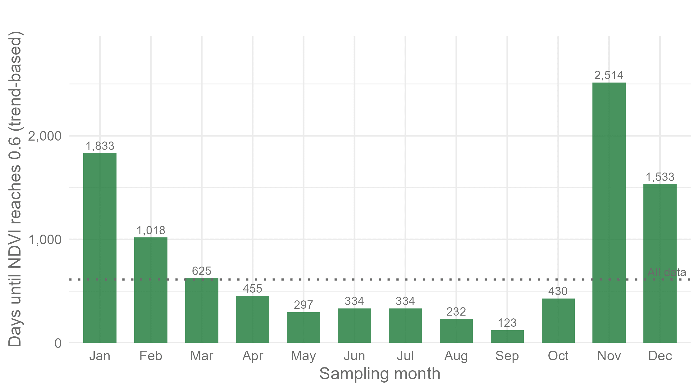
In rehabilitation, trends are often used to support decisions and milestones. To illustrate this, I took the linear trend from each monthly sampling scenario and asked a deliberately simple question:
Based on this trend, how long would it take for the site to reach an NDVI value of 0.6?
This threshold is arbitrary, but it serves as a stand-in for the kind of numeric trigger that often appears in reporting frameworks.
The results vary dramatically. Depending on which month is used for annual sampling, the estimated time to reach this threshold differs by years.
In some cases, the site appears close to achieving the target. In others, it looks much further away.
Yet nothing about the site itself has changed, only the sampling strategy.
A necessary caveat and disclaimer 🙂
These projections are based on simple linear models. Real systems are not linear, and thresholds can be crossed earlier or later depending on future conditions.
That caveat is important. But it does not weaken the point. If anything, it strengthens it. Because if even a simple model produces wildly different conclusions depending on sampling month, then confidence based on sparse observations alone should be treated with caution.
It’s also important to be clear about what this analysis is not saying. It is not an argument against annual sampling. Annual sampling is often necessary. Field surveys, drone campaigns, and detailed assessments are expensive, logistically complex, and sometimes risky. They provide information that high-frequency data cannot. Things like species composition, structure, and on-the-ground context.
The issue is not that annual data are wrong. It’s that annual data are conditional. When we rely on a small number of observations, the timing of those observations matters enormously. Without additional context, it’s easy to mistake seasonal effects for trends, or to over- or under-estimate progress.
High-frequency data provides context, not replacement
High-temporal-resolution data whether from satellites, in-situ sensors, or other sources are not a replacement for detailed fieldwork. But the value in frequent observations lies in providing context, joining the dots, and letting us know how we get from point A to point B. Frequent observations allow us to:
see seasonal patterns rather than single values;
distinguish short-term variability from long-term change;
understand how systems respond to stress and recovery; and
interpret sparse measurements within a broader trajectory.
In this role, high-frequency data don’t compete with annual sampling, but they do help to explain it.
Designing monitoring with time in mind
We argue endlessly about what and where, and almost never about when and how often. We even talk about resolution as if there is only one type – and it’s definitely spatial! Yet if rehabilitation monitoring is about understanding trajectories rather than snapshots, then temporal design deserves the same attention we give to spatial resolution.
Questions worth asking include:
How often do we need to observe this system to separate trend from seasonality?
What context is required to interpret our field measurements? This may include specific flowering or green-up stages of vegetation.
Where does sparse sampling carry the greatest risk of misinterpretation?
These questions are more important to answer than ‘at what time is the ecologist the cheapest?’.

The bigger picture
When monitoring programs underperform, it is rarely because the data are wrong. More often, it’s because the questions being asked are not well aligned with the dynamics of the system, or because the way data are collected does not match the questions we actually need answered.
Stepping back can be valuable. Are we asking questions that reflect how this system changes through time? Are our sampling strategies designed to capture those dynamics, or are they driven by convenience and habit? Which metrics genuinely matter for decision-making, and what is the most appropriate way to measure them?
In short, the temporal dimension of our data is critical for turning observations into understanding. But it also needs to be handled thoughtfully. Despite the case for higher-frequency observations, more is not always better. Data toxicity is real, and without clear questions, well-designed analytical workflows, and careful interpretation, dense time series can leave us in a tangled mess rather than sharpening insight.
In the next post, I’ll step back from individual datasets and look at how satellites, drones, and field surveys can be combined into a monitoring hierarchy that balances cost, spatial resolution, and temporal insight.
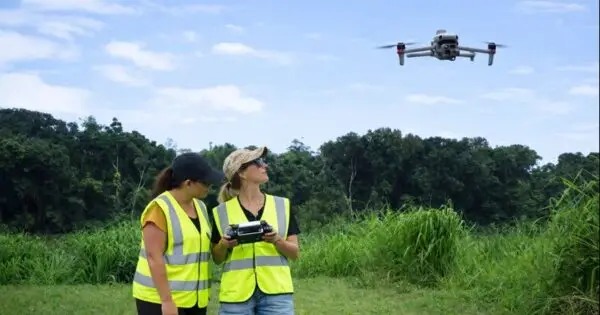
Banner image by Aron Visuals on Unsplash