2025 was a big year for GeoNadir! Not just because we shipped more features, but because we delivered on removing friction between data, insight, and action.
Across the year, our updates centred on three core goals:
- Scaling insights beyond the drone flight;
- Making analysis more intuitive, visual, and transparent; and
- Reducing the time it takes to go from mapping to meaning.
Here’s a look at what that mean in practice, through the lens of customer benefits, not just our fortnightly release notes!
Contents
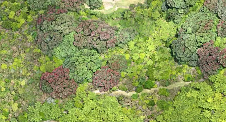
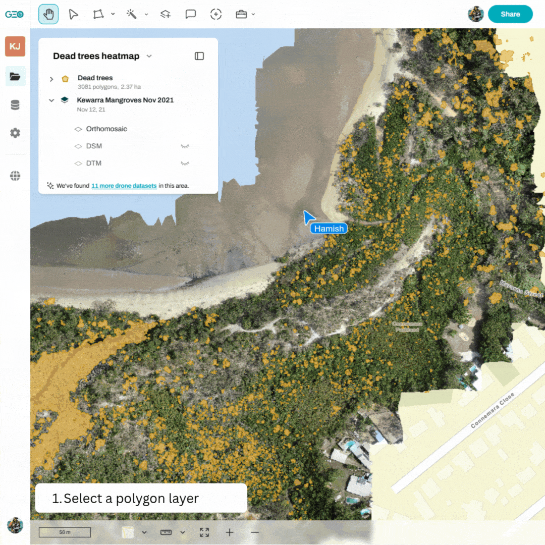
From local detail to landscape-scale insights
One of the strongest themes of 2025 was helping users scale what they map locally with drones to much larger areas using satellite data, without losing confidence or context.
You can now:
-
Predict the density of any feature you map with a drone across an entire Sentinel-2 scene;
-
Use polygons or mapped features to extrapolate patterns well beyond your flight area; and
-
Generate heatmaps and density surfaces that show where things are concentrated, not just if they exist.
Why this matters:
This bridges a critical gap. Drones give detail, satellites give coverage, and GeoNadir now helps you connect the two. So whether you’re monitoring vegetation, habitat condition, land cover, or environmental offsets, you can move from sample areas to landscape-scale evidence far more confidently.
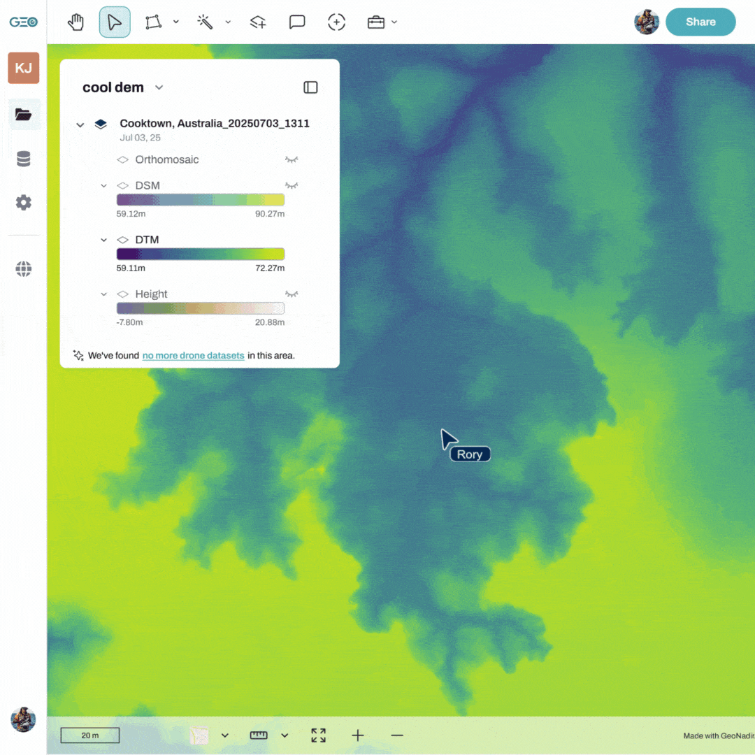
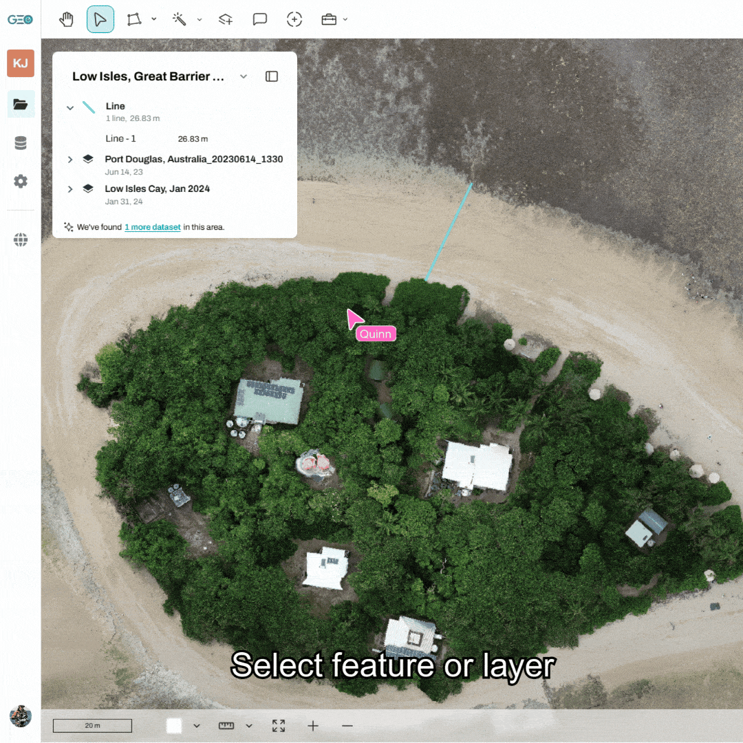
Better visuals = faster understanding
Maps are only powerful if they’re easy to interpret. Especially when sharing results with clients, collaborators, or non-technical stakeholders.
Throughout 2025 we invested heavily in map styling, contrast, and clarity.
You can now:
Apply consistent, high-contrast colour ramps across classifications, DSMs, DTMs, heatmaps, and change layers;
See actual numerical values behind colour ramps for transparency and trust;
Use a purpose-built colour picker with presets designed for clarity and accessibility; and
Adjust classification transparency and styling on the fly.
Why this matters:
Clear maps reduce explanation time. They help insights land faster, reduce misinterpretation, and make interactive sharing far more effective than static screenshots or PDFs.
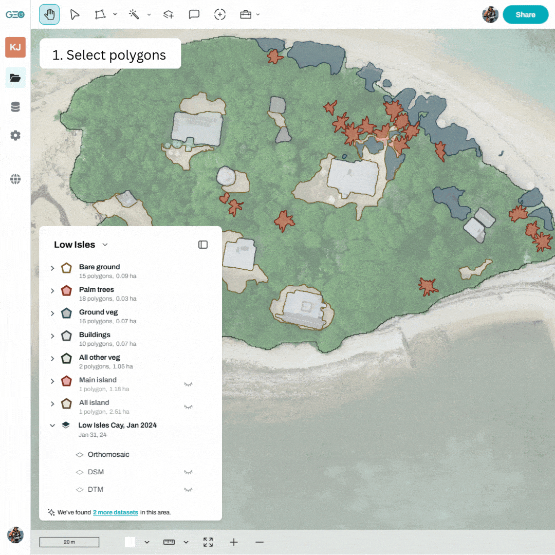
Analysis that feels less like complicated GIS
A major focus this year was making analysis workflows smoother, more forgiving, and more aligned with how people actually work.
Dataset and polygon statistics now support much larger areas;
Summary statistics can be generated across all polygons or based on spatial overlap with drone data; and
Accuracy metrics for classifications are interactive and visual.
Why this matters:
You spend less time breaking jobs into artificial chunks, and more time exploring patterns and validating results. What’s more, everyone in your team can easily access the data and visualisations. No GIS experience (or downloads) needed.
Classification that fits your features and projects
Building on our geoAI features from last year (magic wand and feature finder) , classification workflows in GeoNadir became significantly more flexible in 2025.
You can now:
Train random forest models using multiple layers;
Use points, polygons, or both as training data;
Apply object-based image analysis where pixel-based methods fall short; and
Crop, reapply, and restyle classifications without starting over.
Why this matters:
Real-world projects are messy. These changes mean GeoNadir adapts to your data, not the other way around. And you can classify whatever you want!
Sentinel-2, without the satellite integration headaches
Satellite data are powerful, but traditionally hard to incorporate into multi-scaled workflows. This year we focused on making Sentinel-2 feel approachable.
You can now:
Stream Sentinel-2 data directly into your project based on location, date, and cloud cover;
Filter scenes post-2017 and visually compare them;
Run pixel-based and object-based classifications; and
Explore an expanded suite of spectral indices (not just NDVI) with full styling, cropping, and inspection tools.
Why this matters:
Satellite analysis no longer needs specialist software or steep learning curves. You and your team can move seamlessly between drone and satellite data in one environment.
Editing, digitising, and collaboration – smoother by design
Small workflow improvements often make the biggest difference day-to-day.
In 2025 we:
Improved digitising smoothness and hover/selection feedback;
Added copy, cut, and paste between layers;
Introduced markdown support in project descriptions for links and structured notes;
Refined UI consistency across tools and modals; and
Made downloads clearer, cleaner, and easier to manage.
Why this matters:
Less friction means less cognitive load. Especially when working collaboratively or jumping between tasks.
Learning matters too: Our drone mapping course relaunch
Alongside platform updates, we also relaunched our online drone mapping course in 2025 with major enhancements.
What’s new:
Improved structure and clarity across existing modules;
An entirely new data analysis module; and
Step-by-step tutorials that walk through real workflows, not just theory.
Best of all, the course is freely available for a limited time, thanks to support from the NRMA Insurance Help Fund.
Why this matters:
Tools are only powerful if people know how to use them. This relaunch reflects our belief that access to geospatial knowledge should be as open as access to the data itself.
If 2025 was about helping users scale from local detail to landscape-scale insight, early 2026 is about adding a time dimension to that understanding.
In the first quarter of next year, our focus is shifting strongly toward multi-temporal analysis. Not just comparing two dates, but working with many dates to explore patterns, trends, and trajectories through time.
This means moving beyond simple “before and after” change detection and toward questions like:
How is this area evolving over time?
Are changes gradual, seasonal, cyclical, or abrupt?
Which locations are stable, recovering, degrading, or transitioning?
How do short-term dynamics relate to longer-term trends?
Our goal is to make it possible to:
Work with time series of drone and satellite data in a more integrated way;
Visualise and analyse temporal trajectories, not just differences; and
Identify patterns that matter for environmental monitoring, land management, and decision-making, without requiring specialist time-series software.
As always, the emphasis is on keeping these workflows intuitive, visual, and grounded in real-world use cases, so temporal analysis becomes something you explore, not something you dread setting up.
We’re excited about where this takes GeoNadir, from mapping places, to understanding how places change through time.
We are grateful to our users who continuously push us to make GeoNadir faster, clearer, and more useful for real-world environmental and spatial decision-making.
So, if you’ve been building with us this year – thank you. And if you’re just getting started, there’s never been a better time!
Happy holidays from the GeoNadir team 🙂