Following a long, hot, and relentless summer, corals in the southern hemisphere must surely be breathing a sigh of relief. Those that still can, that is. Record high sea surface temperatures for extended periods set off mass coral bleaching episodes globally, and the Great Barrier Reef was no exception. And while surveys during the height of the bleaching documented the devastating extent, little evidence is available as to the fate of the affected corals. Did they recover from the bleaching, or have they died and since been overgrown by algae?
Contents
- Mass coral bleaching on Lizard Island reef was drone mapped in March 2024, and made available on GeoNadir.
- Scientists from Macquarie University, James Cook University, and GeoNadir repeated the survey in June 2024. Their analysis on GeoNadir reveals in excess of 97% coral mortality.
- The core collaborative foundation of GeoNadir allowed scientists to connect with each other to generate this outcome, promoting transparency in ecosystem changes, and demonstrating the value of open science.
What is coral bleaching?
Corals are a remarkable combination of plant and animal living together. The microscopic algal parts known as zooxanthellae are able to photosynthesize, providing a food source for the animal. But certain stressors on the coral – including extended periods of warm water – can cause the photosynthetic outputs to become toxic for the coral. And so, rather than be poisoned by its food source, the coral expels the zooxanthellae.
At this time the coral reef can become its most vibrant. As the stressed coral fluoresces, bright blues, pinks, and yellows color the underwater world. Then all color is lost, leaving behind the bright white coral skeleton. This process is known as coral bleaching.
If the stress is short lived, the coral may recover. However, persistent stress will lead to mortality.

How do we measure coral bleaching?
Scientists use a range of tools to map, monitor, and mange coral reef ecosystem health. Traditionally, snorkelers and divers conduct surveys, and compare their findings over time. More and more, we are turning to remote sensing technology to document reef habitats from above and below the water.
We can use satellite Earth observation imagery across an entire reef ecosystem like the Great Barrier Reef, but unfortunately lacks the detail we need to effectively map bleaching. Aerial drone data are a fantastic alternative. Drones offer flexibility in terms of being able to capture data under the most appropriate environmental conditions, such as at low tide with low sun angle. We can also fly drones much closer to the coral than any satellite! So the mapping detail we achieve is second to none.
Pictures below by Harriet Spark, Grumpy Turtle Creative
From coral bleaching to mortality
For 25 years, I have sought to answer one research question. How much live coral is on the Great Barrier Reef? Believe it or not, we actually don’t know (read more here). But it’s actually not that surprising given that the Great Barrier Reef is not one, but about 3,000 reefs. And it covers an area equivalent to the size of Victoria plus Tasmania, or all of Italy. Further, most of it is incredibly remote!
It’s devastating to say that this year, my job became so much easier.
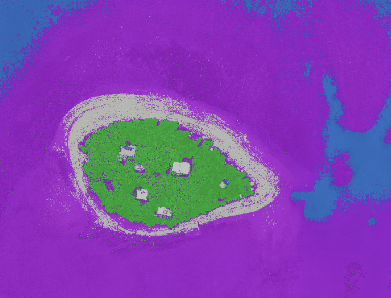
In the small area we see below, only a handful of live corals remain. I can count on my fingers the few colours of hope.


Let’s be clear about this. Healthy coral can be brown. But as much as I’d like it not to be the case, when you look up close, that’s not what we are seeing. This is a graveyard. And algae has already taken up its residence.
Along with my collaborators from Macquarie University and James Cook University, we assessed upwards of 97% mortality.
With collaboration at the heart of GeoNadir’s geospatial tools, our team of scientists were able to interactively quantify the coral mortality. The data are available for all to see and use, bringing transparency to science and hopefully also to policy.

Analysis in detail
At this early stage, we were looking for ‘back of the envelope’ calculations of mortality. So we implemented a quick workflow in GeoNadir that we could all contribute to in real time – or any time.
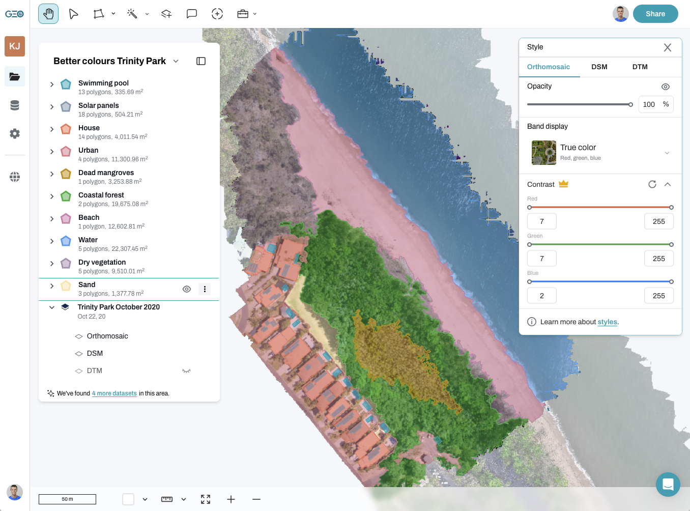
- Data were uploaded to GeoNadir, added to a project, and automatically processed to create an orthomosaic.
- We created a polygon for three 10x10m sample areas – one each for high, medium, and low density coral.
- Each scientist manually digitised the areas of bleaching in the March data, and areas of live coral in the June data.
- For each scientist, we ran a ‘union’ operation to remove any overlapping polygons so areas weren’t double counted.
- We then intersected the coral polygons with the sample quadrat to ‘cookie cut’ out just the analysis area.
- As GeoNadir returns the area of each polygon layer, we used this to calculate the percentage of area bleached compared to that recovered in each of the sample sites.
- We reported the average values for the participating scientists.
Why not AI you ask? At this point we didn’t have the time to train a new model, we thought it most important to get this information out to the public. But of course now we have some training data to work with.


Unfortunately, these images also show that the mortality from this particularly bleaching event is even higher than noted here. That’s because we can even see newly dead coral in the March imagery.
We have since recovered some imagery from December 2021 that will help give a ‘pre-bleaching’ snapshot. The conditions weren’t so favorable and do show that there has been quite a lot of growth in the meantime. So this leaves some hope that we will see some regrowth in the future.
With a proposed visit down under from King Charles and Queen Camilla in the coming months, this could be an opportune time to share how climate change is making its presence felt in this World Heritage Area.
The Great Barrier Reef may have narrowly escaped an ‘in danger’ rating from Unesco, but we clearly have more work to do. And do we have time to wait until 2025 when the next official coral reef condition report is released?


Collaboration makes all the difference
The scales of change that we are talking about here occur over days, weeks, and sometimes months. But in most cases it’s far too costly for individual scientists and managers to visit the reef with that frequency to make the necessary assessments. However, on the flip side, people are out on the reef all the time. There is actually no need for single agencies or individuals to wait for their annual survey trips to get the data needed for informed decisions if we collaborate.
GeoNadir changes the game for Earth observation intelligence based on collaboration, networks, and science grade tools with everyday simplicity.
For example, the coral bleaching imagery you’ve seen above was captured by Dr George Roff at the Commonwealth Scientific and Industrial Research Organisation (CSIRO) and widely publicized in global media. When he uploaded the data for processing and sharing to GeoNadir, we saw an opportunity to continue the story.
Through separately funded work to monitor sea cucumbers (Great Barrier Reef Foundation), our team led by Professor Jane Williamson at Macquarie University was already planning to revisit close to the same site three months later. By knowing exactly where Dr Roff surveyed in March, we replicated these areas to assess the reef recovery post coral bleaching.
Our call for open science
Our findings of mass coral mortality won’t surprise anyone who has visited the reef in recent months. So why must we wait for annual surveys from the Great Barrier Reef Marine Park Authority (GBRMPA) and the Australian Institute of Marine Science (AIMS) for official data?
Each year, over two million people visit the Great Barrier Reef, including scientists, tourists, and commercial operators. We have a unique opportunity to leverage data from this diverse group to enhance our understanding of the reef’s health.
Currently, there is no coordinated approach to use these potential data sources. Citizen science initiatives like Reef Check and the Great Reef Census contribute significantly to reef assessment. Additionally, hundreds of scientists are gathering critical data across the reef. However, much of these data are not FAIR (findable, accessible, interoperable, and reusable).
Maintaining FAIR data can be costly for organizations, requiring investment in databases, cloud servers, and user-friendly interfaces. This financial burden often discourages open science practices.
Furthermore, some scientists and organizations withhold data to secure their own publications or ‘scoops’, driven by the competitive nature of funding. This delays the availability of timely information.
The findings in this article are possible because of a commitment to open science. When Dr. Roff from CSIRO made the coral bleaching drone mapping dataset openly available, it initiated a collaboration. During an unrelated survey trip, we were able to resurvey the same area and calculate mortality rates.
We have unprecedented amounts of data on the Great Barrier Reef. Yet, if these data remain siloed or stored on personal drives, its full potential cannot be realized. We need better systems to support and incentivize open science, promoting collaboration over competition. This will enable management to access and incorporate diverse data streams for more informed decision-making.


