Satellite-derived global mapping products are the backbone of many decisions we make in environmental science and management. From tracking deforestation to identifying coral habitats, these maps give us a bird’s eye view of the planet. But just how accurate are they? And what happens when they’re wrong?
We tested several widely used global land and habitat maps against high spatial resolution drone data from the GeoNadir platform. The results revealed a cautionary tale about blind trust in satellite maps, and a call to rethink how we create and use them.
This blog is derived from a presentation I gave at the European Space Agency Living Planet Symposium, Vienna, Austria in June 2025 and co-authored by Amy-Nicole Peters and Joan Li. The work was supported by SmartSat CRC Queensland Earth observation hub.
Contents
Do we understand map accuracy?
At the recent Living Planet Symposium, I asked: Do you use global or national satellite mapping products? Almost everyone said yes.
Do you know the stated accuracy of those maps? Almost everyone said no.
And how accurate do you think they really are? Most people guessed above 60%, some didn’t know, and very few thought the maps were over 80% accurate.
This isn’t surprising. Many mapping products come with blanket accuracy statements, like:
MODIS Land Cover (MCD12Q1): 72%
Allen Coral Atlas: 60–90%
But accuracy on paper doesn’t always match reality on the ground – or in the sea.
Putting global mapping products to the test
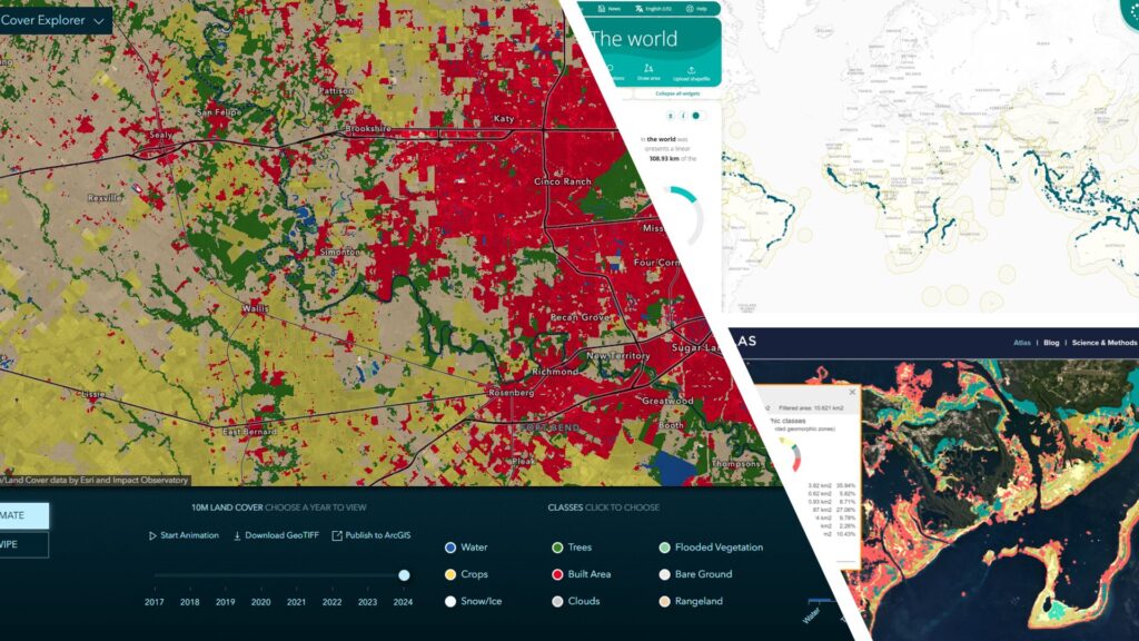
To find out how these maps hold up, we used 168,610 validation labels derived from 1,217 drone datasets, spanning ecosystems around the globe. All of these datasets are openly available via GeoNadir, which now hosts more than 3.5 million drone images from 90 countries.
Using these drone-based validation data, here’s what we found:
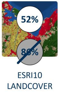
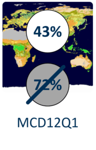
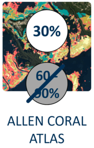
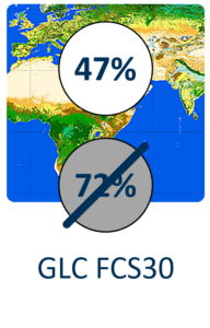
The gap between claimed and observed accuracy is significant. Some class-specific accuracies were as low as 30%. In some regions, this could mean that the dominant land or seabed class is being misrepresented.
Why does mapping (in)accuracy matter?
Incorrect maps don’t just stay in GIS software—they flow downstream into major real-world decisions. Here are three examples:
1. Sea cucumber fisheries
Species distribution models for high-value fisheries like sea cucumbers rely on benthic habitat maps. If those base maps misclassify habitat types (e.g. mistaking sand for seagrass), we could grossly overestimate or underestimate population stocks. That might mean lost income, or fishery collapse.
2. Carbon credit markets
Vegetation type and density underpin carbon estimates. Inaccurate landcover maps could distort carbon accounting and lead to misallocated carbon credits, undermining the very market mechanisms meant to combat climate change.
3. Agricultural subsidies
In the EU, policies like the Common Agricultural Policy fund are linked to landcover type. Greece was recently fined $400 million due to misreported land types. When maps are wrong, the financial implications are huge.
Two types of mapping error
1. Misclassification
This is when a pixel is labeled as something it’s not. For example, seagrass being mapped as sand, or forest being misidentified as cropland.
2. Sub-pixel mixing
This is more subtle. A 10 m satellite pixel might contain both sand and seagrass, but the map might assign it a single label, like sand. The map isn’t technically wrong, but it’s incomplete.
We see the same challenge in society: our tendency to simplify things into categories—man/woman, blonde/brunette/red, tall/short – when the reality is far more nuanced. Just as human identities exist on a spectrum, so too do the environments we’re trying to map.
A case study from Warrior Reef
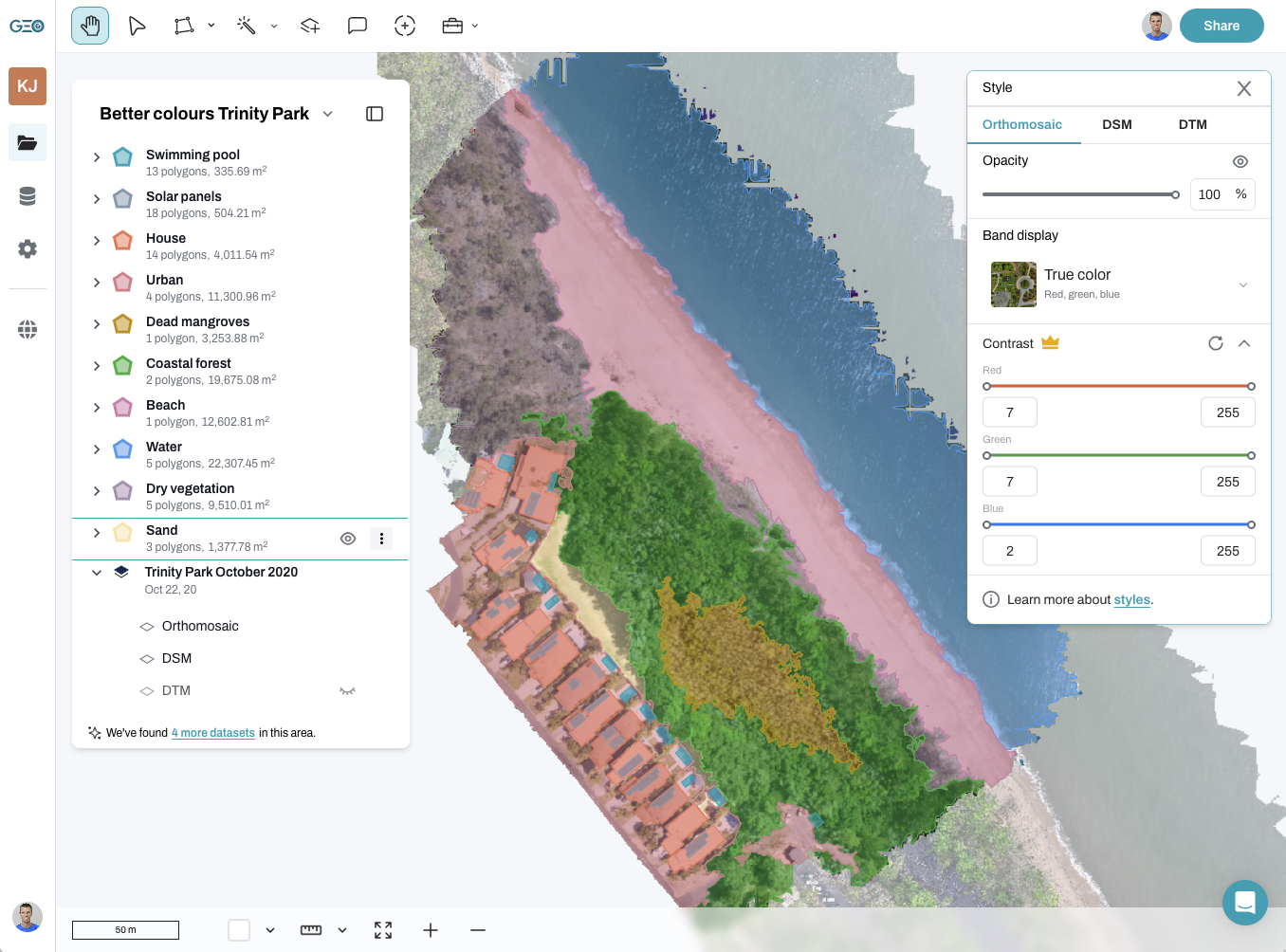
On Warrior Reef in the Torres Strait, we mapped seagrass habitats as part of our work to support sea cucumber management with Macquarie University, Griffith University, and James Cook University. We used a combination of:
Aerial drone imagery
Underwater ROV video
Surface drone cameras
The drone imagery was analysed with a supervised random forest model. Then we quantified seagrass density within 10×10 m cells to match Sentinel-2 resolution. These density values were then used to train a Sentinel-2-based model, resulting in a regional seagrass density map.
This method moved us from categorical mapping (“is there seagrass here?”) to quantitative mapping (“how much seagrass is here?”). That’s important because sea cucumbers prefer intermediate seagrass densities – neither too sparse nor too dense. This “Goldilocks zone” is lost when maps only tell us presence or absence.
GeoNadir’s integration of random forest classification, streaming Sentinel-2 data, and AI tools like SAM and Grounding DINO is enabling this kind of workflow at scale. With these tools, we can build accurate, nuanced training data to improve satellite-based models.

Are wrong maps better than no maps?
I ended my presentation at Living Planet Symposium with this question. Most people didn’t want to answer.
Because, like so many things, it depends.
While having a map is often better than nothing, inaccurate maps can mislead more than they help, especially when the error is invisible to the user. Published maps including global mapping products carry an inherent authority. People tend to trust what they see, even if it’s wrong.
That’s why the responsibility falls on us as scientists, product developers, and data providers, to make sure our maps are as accurate, transparent, and updatable as possible.
A way forward for global mapping products
We won’t solve global problems with local-only solutions. Drone data alone can’t replace satellites. But drone-derived labels can help validate and calibrate global satellite models.
We need to move toward:
Better validation using high-quality, FAIR datasets
Quantitative rather than purely categorical mapping
Openness about error types and accuracy
New models that can handle mixed-pixel realities
Ultimately, the goal isn’t to create perfect maps. It’s to create useful maps—and to know where their limits lie.